


Watch-The-Skies
-
Posts
4 -
Joined
-
Last visited
Watch-The-Skies's Achievements
")
Wolf Bait (1/9)
12
Reputation
-
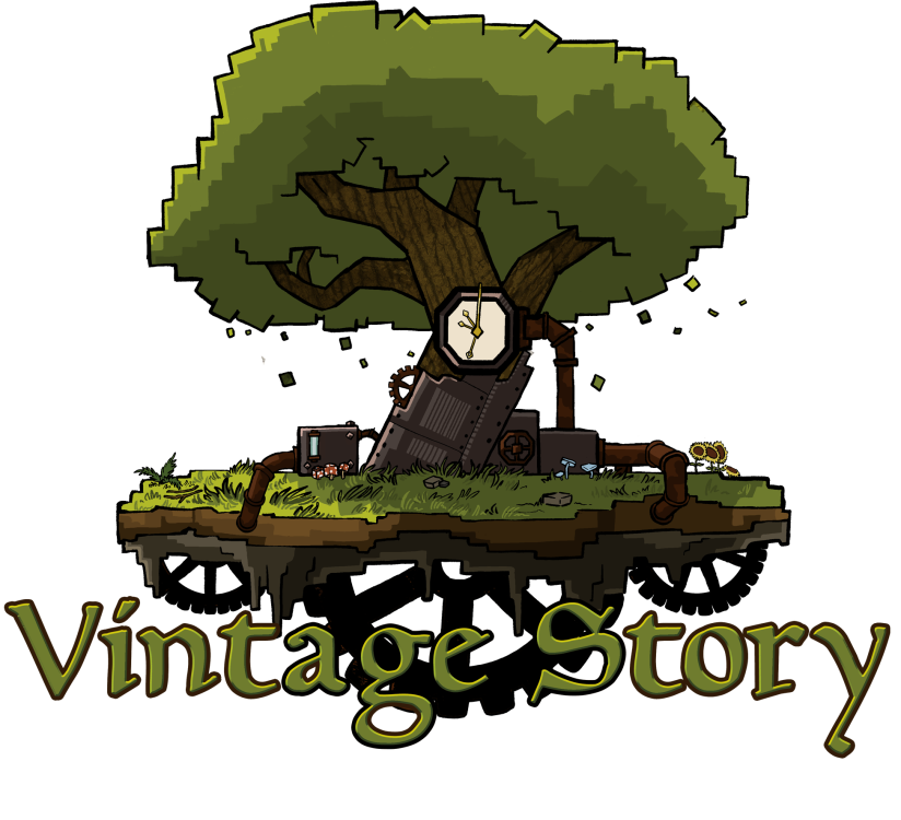
I'll wait for a version 2 taking into account the feedback I've seen here. Before giving extended thoughts. Main things I recommend are: -Ditching the faux-voxel/pixel art elements in the logo. VS is more like a voxel representation of the natural world than a world made up of blocks. Making a realistic non-voxel creeper would feel weird, but making a realistic version of the VS enemies like shivers feels fitting. It's a bit too cartoony and gives the wrong impression that this'll be something more like hytale or minecraft in presentation. -Simplify some of the details in the logo. I think less machinery on the tree would be better and I think would be more intriguing to leave it as a subtle detail like the original logo. Also darken the gears on the bottom to be black. I think having a volume of black shapes on the bottom sorta helps ground the top half of the logo. -Make the colors a bit more sepia to fit with the game's wider aesthetic and vibes Rough edit with some minor tweaks:
- 302 replies
-
- 10
-

-


