


Henninator
-
Posts
2 -
Joined
-
Last visited
Henninator's Achievements
")
Wolf Bait (1/9)
4
Reputation
-
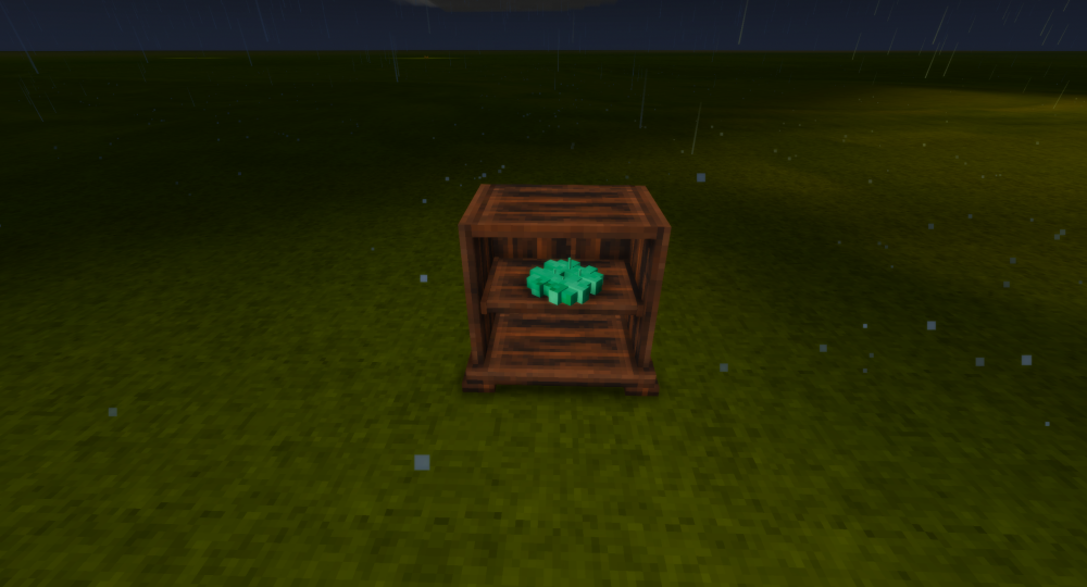
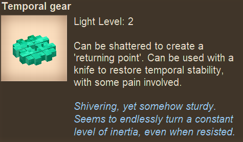
I noticed that the temporal gears behave stationary in the shelves. That would go against the established lore of them being in a constant motion. I suggest that they should float a bit and spin slowly, just like when dropped, when put on shelves or similar.
-
I like the washed, rounder design of the older one more. It kind of has this subtile rusted flair that fits with the game. I also think that the new one is too cluttered to look coherent at a glance. The segmented tree parts look a bit off in my opinion and could use a bit of smoothing. That being said, I think that if it were simpler, the logo would look great!


