


Zorkman
-
Posts
6 -
Joined
-
Last visited
Content Type
Profiles
Forums
Blogs
News
Store
Everything posted by Zorkman
-
this is nice, i really enjoy this take for a tree-centric design
-
understandable, though i reiterate that this was only done as a fun design exploration. any real designing to be done in any capacity is purely on the devs i'd imagine
-
thanks also. my drawings are really not a serious suggestion and were only for fun, but i'm glad to hear i managed to make something that works somewhat lmao but also i forgot factorio was a thing (it's so over)
-
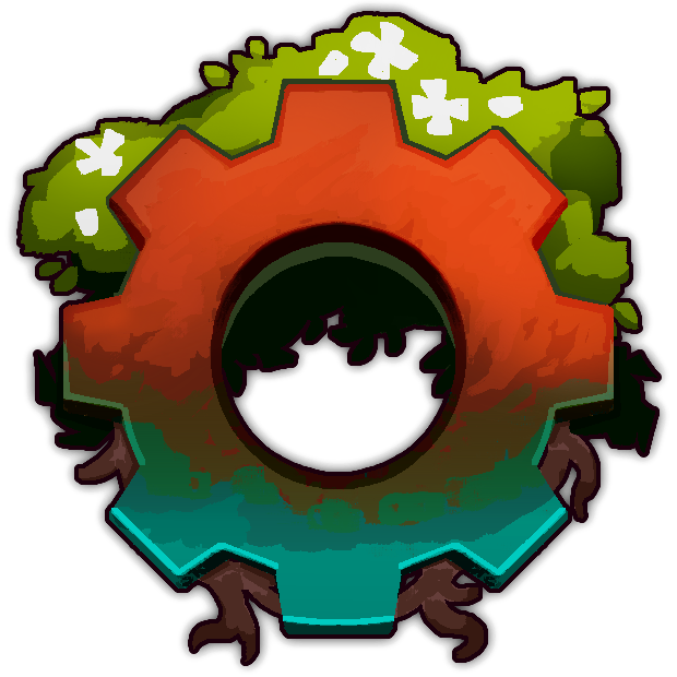
thanks. as for the flowers, the reason they're so simple is to not overcomplicate it and mostly just imply their shape from a distance. felt wrong to NOT have something there on the green otherwise
-
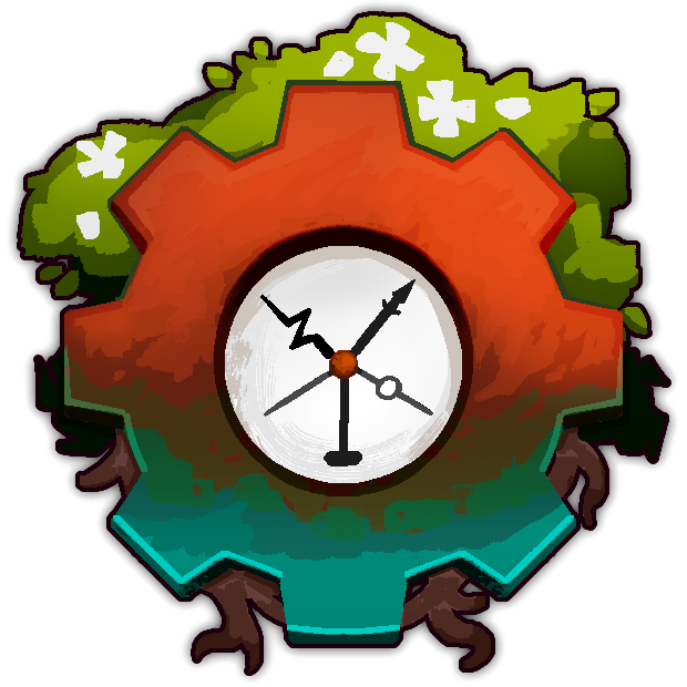
i'm seeing a variety of suggestions and vibe assessments here, and i almost find it more fascinating how Vintage really evokes different feelings for different folks. my own opinion on the matter is thus: i think both the old one and the new one are very elaborate, which from a logo design perspective could get kind of iffy. i read the grievances of the logos being more illustrations than something iconographic which i can understand, but i also think that kitsch and busy designs CAN be done right if they focus the implemented detail in the right ways. the old one has a rustic charm to it by this point, the new one is a very different stylistic take but a better overall silhouette and text placement. a mix of the two could be interesting assuming that the idea is to keep the design identical thematically, what with the tree and all having said that, i don't think these designs would really be a good fit for a desktop icon specifically unless they were tinkered to look good at a distance. for that, i think the gear designs people have been positing would honestly be a very good direction to go down, i quite like the focus on that as a thematic and design element made my own fun little mockups as to how i'd personally go about it, because it seemed like a fun design challenge
- 302 replies
-
- 18
-

-

-
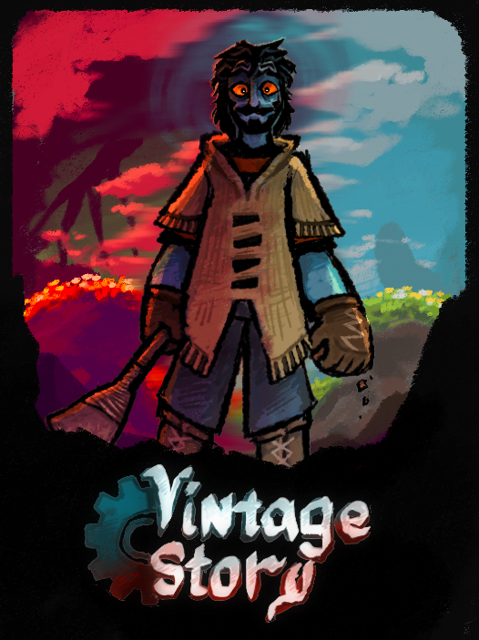
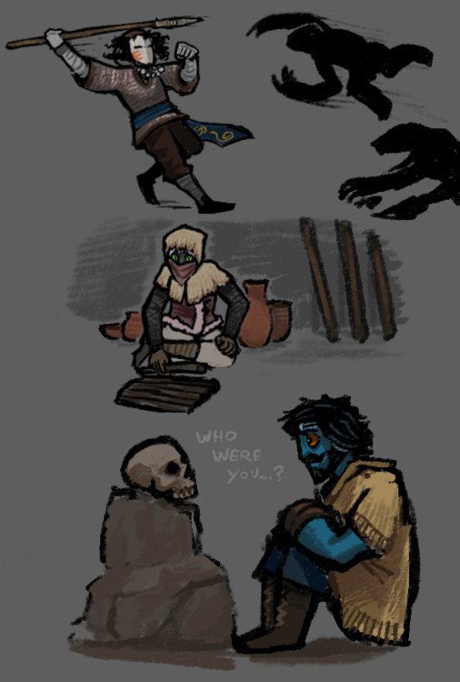
felt inclined to cobble together some fan scribbles in an aggie.io session based on a multiplayer run i'm doing with two friends. game's pretty fun (even if a little complicated for someone with a tiny brain like i)
-
- 17
-
-


