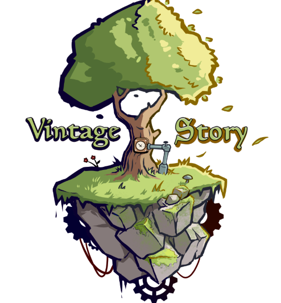
I always thought the old one looked a little messy, but it did do a decent job of capturing the game's vibe. For the new one, I think the blocky stile is fine, but as other people have mentioned it feels to clean or even Hytale-y. The thick consistent outlines are a little too noticeable and the way the tree and leaves at the top are so healthy and large is not ideal. I think if the new model were reworked to be more gritty and imperfect it would be better. Also if the tree more like the old one in the way it felt a little odd, wrong, or mysterious, and you adopted a more muted, it would feel more accurate to the game. Other then that, prefer the new one. I voted reworked because I do think the tree needs a rework, even if this one isn't perfect.
I also agree with @Nicodemus that neither logo looks good scaled down. A professional logo should be artistic and beautiful, but it needs to have a recognizable outline and be readable. I actually think the gear idea is great as far as that goes, but doesn't quite have enough vintage story in it. I think finding a way to have a unique and recognizable symbol that still really conveys what your game is is important.
As for integrating that stile into the rest of the game a bit, I have similar thoughts. I like it being a bit cleaner or more readable, but it still needs that rusty or muddy look. Vibrant is fine, but not hytaley or unrealistic. Readable is fine, but not digital or high tech. Dramatic is fine, but not obvious or fantasy. You get the idea, the list goes on.
Here is an example of a vintage story logo that is vibrant and a little voxely without being cartoony in a bad way, by N_H_Illustration on reddit. I think it has a nice muted look, though still is a bit too complex to be readable and needs more of that orangey and rusty color. I think something between these four logos is what we need. The clean and vibrant look of the one in this post, maybe the slightly voxely and professional look of the reworked, and the rusty colors of the old one and the gear from Nicodemus.
.