
.png.4aab4d9d8257ddc963e3a9dd5cd2f7f3.png)

Nicodemus
-
Posts
47 -
Joined
-
Last visited
-
Days Won
2
Nicodemus's Achievements
")
Potter (4/9)
212
Reputation
-
I tried your method to point to my VS data folder on my D disk, and got an answer like "Can't create an already existing folder". And there wasn't a --dataPath. So ¯\_(ツ)_/¯
-
Just to be clear, after an update of the game: --dataPath your:\path\here --addModPath your:\path\here And if the game still doesn't load your mods, open the new data folder, then the "clientsettings.json" file, scroll all the way to the bottom of the file, and below "modPaths", change to the path of the Mods folder located in the new data folder. Thanks @Streetwind for the detailed method.
-
I think this only works if you didn't use the "--dataPath" method for previous versions of the game.
-
With players maybe, but not from the game itself
-
Real solid work indeed, thanks. I agree the silver and dark edge versions don't do better. Still a little annoyed by something but don't know what... But yeah, thanks for all the tests
-
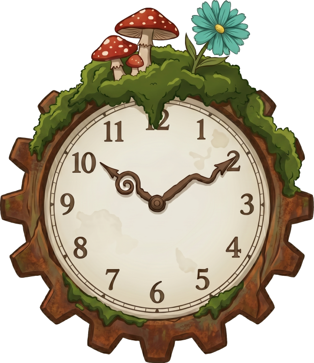
@DarkGold On second thought, I think it would be logical that the edges of the clock were in light gray, like metallic (not yellow/gold because of the clock's hands), to keep the rusty parts separate, because the rest doesn't look rusty, so no real reason to put that in brown imo. And then you could pick a dark gray for behind the gear (not sure at all ^^), or maybe then if you go back to white it would look better than before... dunno ^^
-
Nice idea! I prefer the darker branch version. But I think the white background behind the temporal gear gives the feeling it kinda levitates. Another color would help to counter that.
-
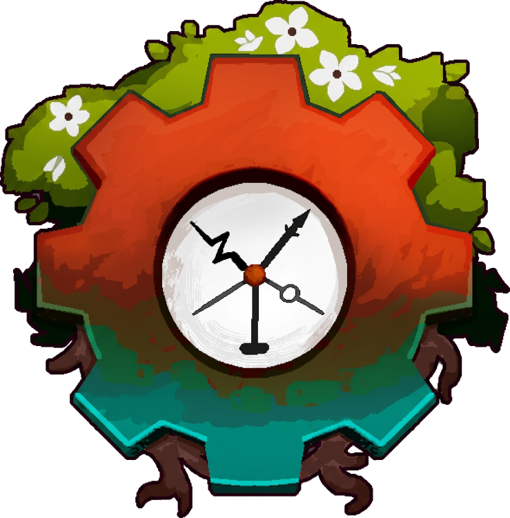
New edit of @Zorkman version: More Vintage Story greens
-
Sorry but I don't see how you can say that a clock is a poor represation of temporality/time... which is the central theme of the game's lore. You're not the first to say that, but I really don't get it. It seems perfectly logical to me. And we don't need an 'actual tree with a clock' in the game (others were complaining that it didn't make sense) when the logo is meant to reflect the game's central themes...
-
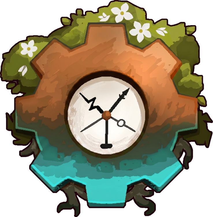
I took the liberty of tweaking the flowers a bit and also creating a version with less saturation:

- 320 replies
-
- 10
-

-

-
I linked these new versions in my 1st post
-
I think it's already really good too, that's why I take the liberty of being a bit picky
-
I understand but I think you can try to make them a bit less simple in order to look good also in large sizes, because Tyron spoke about merch too
-
I really like the second one! Except maybe the flowers on top which look a little too much like they were drawn by a child ^^'
-
As @Benjo pointed out, my previous suggestion was far too similar to Factorio's icon. Here's another try. I've also simplified the design to make it look more like a logo.
- 320 replies
-
- 10
-
-


