BluntTongs
-
Posts
2 -
Joined
-
Last visited
2 Followers


BluntTongs's Achievements
")
Wolf Bait (1/9)
16
Reputation
-
A lot of comments I've read here point out how the original logo feels more organic, and I have to echo that. I really like the painterly, less saturated kind of style and how there aren't any solid outlines for any of the elements and I consider it iconic. It also looks great scaled down! I wouldn't mind the new logo so much but it feels a lot more complicated and cluttered than it needs to be and de-emphasizes the dominant 'nature' aspect of the game by cluttering the base of the tree with assorted steamwork bits. The original was more subtle about the mechanical parts and just had the silhouetted gears below the earth and the clock as its main focus, and I thought that was plenty to convey the idea. I also liked that the tree is so tall and kinda twisted around itself in a fun way, and the canopy balances better with the ground underneath it by taking up less of the space (especially horizontally) - In the new logo the tree canopy and the ground are about equal in breadth and it leads to the image not really have the same sort of visual draw downward. This left space to the sides to put the game title in instead of having to cram it awkwardly over the gears, which further clutters the legibility and detracts from a core part of the art itself, the gears. I think ultimately that regardless of the details and color palette, the new logo is just too blocky and cartoonish for no real benefit. As others have stated it feels more like the logo art for a Minecraft mod rather than its own game. If it was just a painting of a tree with clockwork and steampipes - like the original logo - it would feel more at place with the overwhelming "nature and untamed wilderness" theme the game has... Kind of hard to articulate what I mean, but the vibe of a smooth painting, or honestly even the rough sketch kind of look of the other pieces of official art, definitely fits Vintage Story. The blockiness feels less like an inspired choice and more like... "Well, it's a block game, so we have to make the logo blocky" which is silly. That's what EVERY uninspired block game uses for their key art!
-
Display Case Types / Better Displayed Butterfly Visibility
BluntTongs replied to ArtiKs's topic in Suggestions
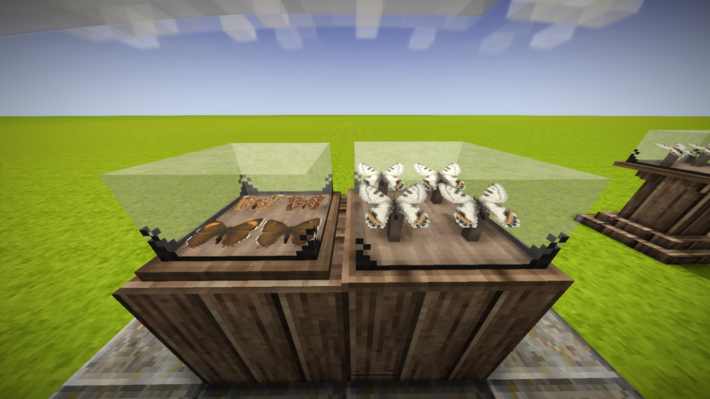
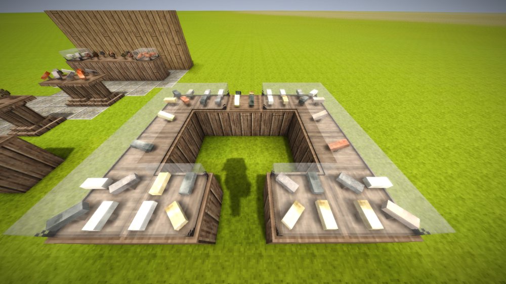
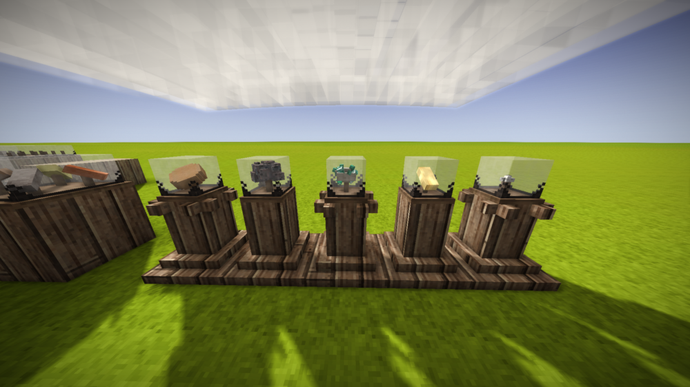
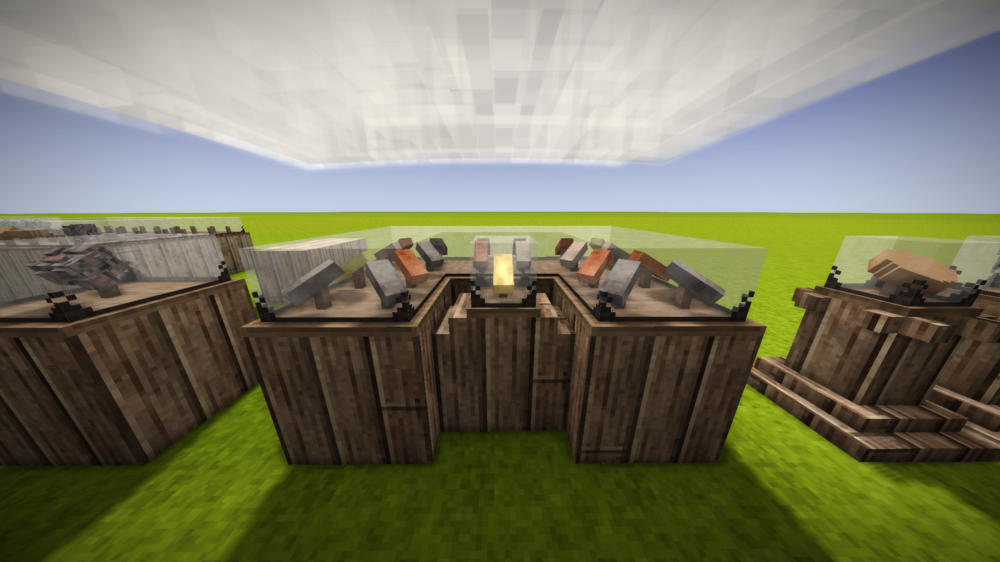
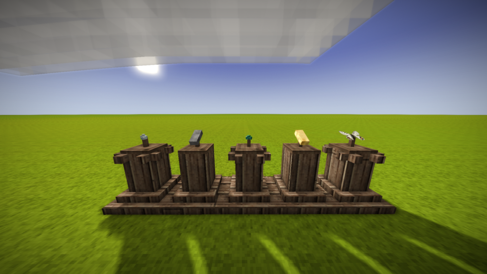
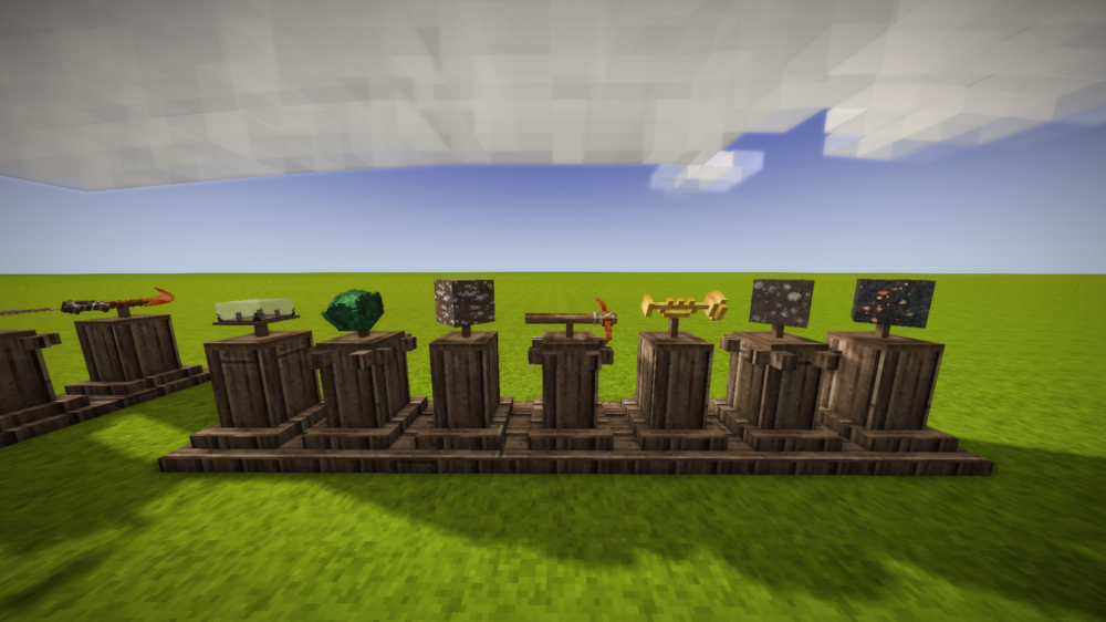
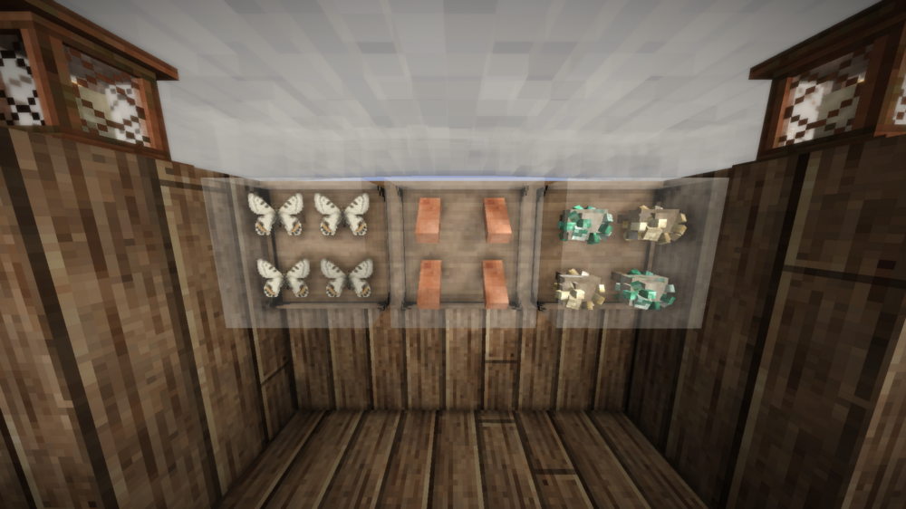
Okay you might freak over this, but I've actually been working on a mod these past few weeks, Museum Cases, EXACTLY BECAUSE of the reasons you described, and with similar solutions!! The base display case is kind of not great IMO because of the enforced +45 degree spin plus a random extra amount of spin making it look like my seraph is just haphazardly throwing these things into a glass box instead of actively curating the thing, on top of it being completely worthless for displaying butterflies. If there's gonna be what, like 169 different butterfly variants? We might as well have something *nice* to show them off in. Posting in spoilers so I don't blow out the page here with all the screenshots of a mod. Sorry for making this a "check out my mod" post, I just got excited because this thread was linked to me and I really wanted to share my work since we're sort of on the same track! ...No release window yet because I'm pretty busy during the week, but we're getting pretty close to having something worth installing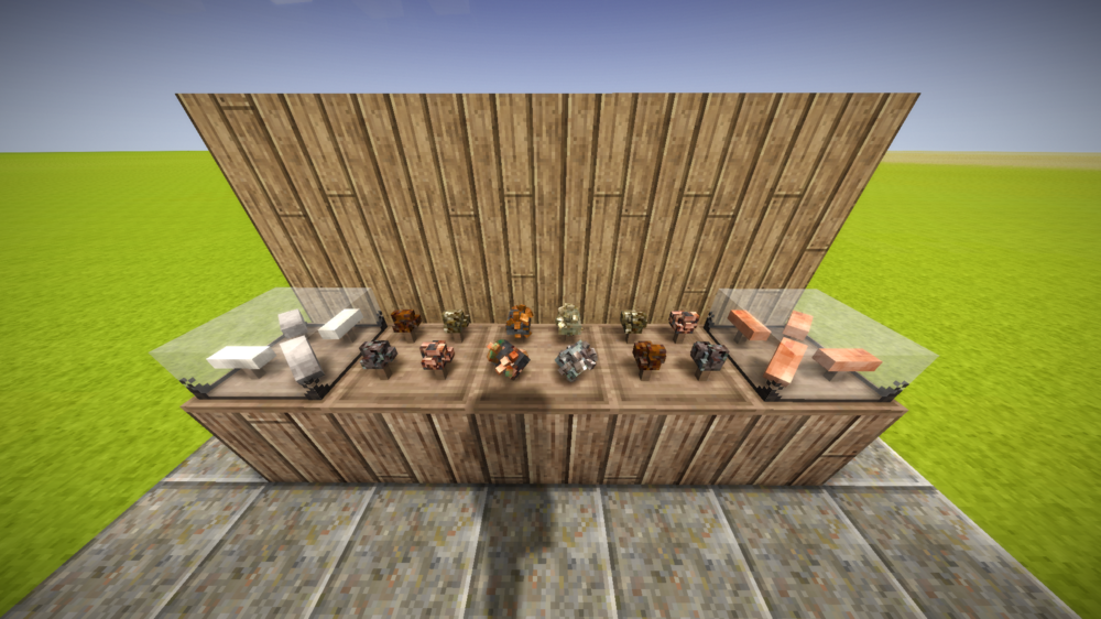
- 4 replies
-
- 11
-

-

-