Thomas J
-
Posts
11 -
Joined
-
Last visited
Content Type
Profiles
Forums
Blogs
News
Store
Everything posted by Thomas J
-
Having read through this thread, I find myself in full agreement with this effort poster, Nicodemus. The old logo has never looked appealing as a desktop icon, nor would the new one Tyron has presented to us. An entirely new logo akin to Nicodemus' should be created, incorporating design elements from the original for the sake of legacy, of course, whilst being beautiful in both large and small forms. Nobody wants low-detail, minimalist nonsense, and a video game logo must be aesthetically pleasing as both an icon and a splash screen. However, if forced to choose between the old logo and the new, I would choose the old one purely for its soul and its history as an established symbol of Vintage Story.
-
The cheer emote, the cry emote, and the bow emote. Shouldn't they have sounds? Especially the cheer and cry emotes, with hip hip hooray's and boo hoo hoo's respectively.
-
- 2
-

-

-
Oceans are here with 1.18, hallelujah! Now all we need are geologically realistic rivers/lakes, and it's a nigh perfect terrain generation system in my book.
-

Vintage Story Wasn't Designed With Multiplayer At It's Core
Thomas J replied to Mindframe's topic in Multiplayer
Good luck! In relation to your talk of "MMO server experience", the community as it stands seems to prefer gated communities of lightly-modded vanilla above all, which frankly is a testament to the quality of the core gameplay loop and to the type of player who particularly enjoys it. It's interesting that minigame and gamemode servers have, thus far, not managed to gain a foothold. Civilization servers of various types have lived and died, as have servers with interesting (though not always fun) gimmicks or server settings, but I have never in all my days seen a minigame server. I probably just missed its coming and going, if it ever came and went at all. I've also never seen hide nor hair of adventure maps, let alone servers that host them on rotation. If I'm ignorant on any of these servers, or if you or anyone else knows an interesting type of server that strays from good 'ol vanilla, I'd be very curious to hear about it. -
Shields exist, but if I may be frank, they are poorly implemented. Having to hold shift to "activate" shields only encourages combat to consist entirely of crouch-walking around each other like turtles, slowly stabbing the other to death. There's no skill or fun involved. The simplest, most barebones solution for this is to activate shields with right click rather than shift, and to implement a cooldown for said activation, effectively turning it into a shield parry. This alone will end the crouch-pvp and add fun/skill to combat.
-
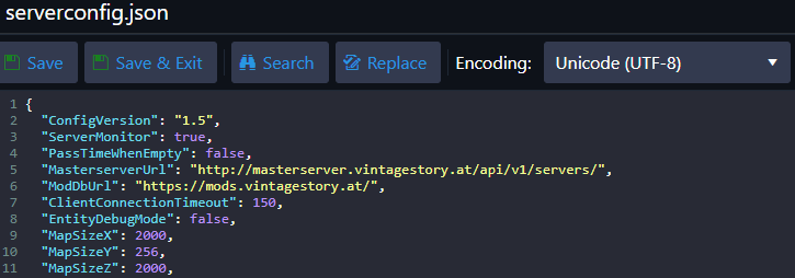
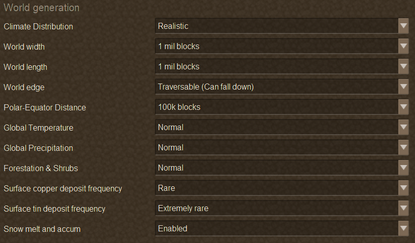
I'm aware that you can customize world size to an extent within the "customize" section of singleplayer new world creation (see attachment 2), though as far as I'm aware you can only determine an exact size through a server config (see attachment 1). However, as far as I can tell, not all customization options for singleplayer are available within the server config, e.g. global temperature, forestation etcetera. What I'm essentially wondering is how I can have the best of both worlds; That is, how can I have an exactly custom world size AND custom forestation/global temp/etcetera?